JadeSkinWindow Class
The
For details about the JadeSkinWindow class properties summarized in the following table, see
| Property | Reference to … |
|---|---|
|
|
A |
|
|
The skin category that applies to the skin |
To understand the way in which a region is constructed, consider that the image specified by the
The result could be a window with rounded corners, a window with holes in it, and so on.
Because the mask image is built to the same size as the actual window, if border masks are defined, the only reasonable region that could be constructed is one where the corners are shaped. As all other areas are stretched to fit, it is likely that they would not provide a suitable result. You would achieve a better result by defining only an inner image for the mask that is stretched.
If the
In addition, you can define a skin category for a control subclass (for example, each
JadeSkinForm Class
The
When erasing the inner area of the form:
-
If the form
-
If the form skin has a
-
If the form
-
If the
-
The Color_3DFace value is used when erasing.
-
If the form was erased using a color and the skin of the form has a
The JadeSkinForm class contains the JADE skins defined for forms in your applications and encapsulates the behavior required to define and maintain JADE skins using the JadeSkinMaintenance and JadeSkinSelection forms provided by the JADE RootSchema.
For details about using runtime skin facilities provided by JADE methods, see "Run Time Skin Facilities", later in this chapter.
The set of skin images used by JADE is provided with the product release so that you can use these skins in your applications, if required. (By default, skins are not used.)
The form border for a skin is made up of 11 images, as shown in the following image.
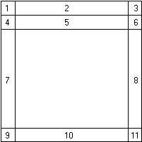
The following is a description f the form border areas.
-
Images 1, 3, 4, 6, 9, and 11 are shown at actual size.
-
Images 2, 5, 7, 8, and 10 are stretched to fit the width or height of the form.
-
Images 1, 2, and 3 must have the same height to enable the form to display correctly.
-
Images 4, 5, and 6 must have the same height to enable the form to display correctly.
-
Images 9, 10, and 11 must have the same height to enable the form to display correctly.
-
The whole of image 1 is treated as the control menu area for the form.
-
When an MDI child is maximized, the whole of image 4 is treated as the system menu area for the MDI child.
-
Form icons are placed adjacently at the top right hand edge of the area defined by image 3.
-
MDI child form icons are placed adjacently at the top right hand edge of the area defined by image 6.
-
Form icons that are disabled are not displayed.
The following areas are not affected by using a skin.
-
Only JADE forms adopt the skin presentation. Windows forms such as message boxes, common dialogs, and the JADE exception dialogs are unchanged.
-
When a form is resized, Windows draws the standard form image while the resize is occurring.
-
A minimized MDI form displays the standard image, as there is normally insufficient room to display the skinned image for that short caption line.
-
Windows-drawn menu items are unchanged by the skin. This includes the system menus.
-
Any changes made to the skin do not affect any current users of that skin.
-
Windows sounds do not occur when forms are minimized, maximized, and so on, as the form buttons are not in the Windows standard positions and their actions must be performed programmatically by JADE. (Windows does not issue those sounds when such actions are performed programmatically.)
For details about maintaining and using JADE skins, see "
For details about the
| Property | Default Value | Description |
|---|---|---|
|
|
Default_Color | Color used to draw caption text when the form is active. |
|
|
False | Specifies whether the caption of the form is bold. |
|
|
False | Specifies whether the caption of the form is italics. |
|
|
Tahoma | Font with which the form caption is displayed. |
|
|
8.25 | Size of the font with which the form caption is displayed. |
|
|
Default_Color | Color used to draw the form’s caption text when the form is inactive. |
|
|
0 | Starting left position of the form’s caption text. |
|
|
0 | Starting right position of the form’s caption text. |
|
|
False | Specifies whether the caption is centered within the top strip area of the form’s skin. |
|
|
Null | Border area image to be drawn for the bottom left of the inactive form. |
|
|
Null | Border area image to be drawn for the bottom right of the inactive form. |
|
|
Null | Border area image to be drawn for the bottom strip of the inactive form. |
|
|
Null | Border area image to be drawn for the left strip of the inactive form. |
|
|
Null | Border area image to be drawn for the right strip of the inactive form. |
|
|
Null | Border area image to be drawn for the top left of the inactive form. |
|
|
Null | Border area image to be drawn for the top right of the inactive form. |
|
|
Null | Border area image to be drawn for the top strip of the inactive form. |
|
|
Null | Image drawn for the left of the form’s menu line. |
|
|
Null | Image drawn for the right of the form’s menu line. |
|
|
Null | Image drawn for the strip of the form’s menu line. |
|
|
Default_Color | Background color for the menu line if the skin has no defined imgMenuStrip property value. |
|
|
Default_Color | Background color of the selected menu items for drop‑down or popup menus. |
|
|
False | Specifies whether menu line item, drop-down menu, and popup menu captions are bold. |
|
|
False | Specifies whether menu line item, drop-down menu, and popup menu captions are italics. |
|
|
Null ("") | Font with which menu line items, drop-down menus, and popup menus are displayed. |
|
|
0 | Size of the font with which menu line items, drop-down menus, and popup menus are displayed. |
|
|
Default_Color | Color to draw the text for non-selected and enabled menu line items. |
|
|
Default_Color | Color to draw the text for disabled menu line items and the default disabled text color for drop-down and popup menus. |
|
|
Default_Color | Color to draw text for selected text for drop-down and popup menus. |
|
|
0 | Starting left position of the form’s menus. |
|
|
0 | Offset of the top position of the form’s menu drawn on the skin. |
|
|
Reference to the simple button images drawn for an MDI child minimize button in its four states (up, down, rollover, and disabled). | |
|
|
Reference to the simple button images drawn for an MDI child restore button in its four states. | |
|
|
Reference to the simple button images drawn for an MDI child terminate button in its four states. | |
|
|
Reference to the simple button images drawn for an MDI child maximize button in its four states. | |
|
|
Reference to the simple button images drawn for an MDI child maximized button in its four states. | |
|
|
Reference to the menu definition of the form. | |
|
|
Reference to the simple button images to be drawn for the form minimize button in its four states. | |
|
|
Reference to the simple button images to be drawn for the form terminate button in its four states. | |
|
|
False | Specifies whether the menu line of the skin is always drawn, regardless of whether the form has a menu. |
|
|
Default_Color | Transparent color to be applied to maximize, minimize, and terminate buttons drawn for the form’s skin. |
JadeSkinControl Class
The
Use the properties of the
-
If the control
-
If the control skin has a
-
If the
-
If the value of the
-
Erase using the
-
If the control was erased using a color and the skin of the control has an inner image defined in the
The constants provided by the
| Constant | Integer Value | Constant | Integer Value |
|---|---|---|---|
| ApplyCondition_3D | 2 | ApplyCondition_All | 0 |
| ApplyCondition_Border | 1 |
For details about the JadeSkinControl class properties summarized in the following table, see
| Property | Default Value | Description |
|---|---|---|
|
|
Dependent on the control type | Determines whether the border area of a control uses the skin |
|
|
BorderStyle_Images | Type of border to be drawn |
|
|
False | Specifies whether the control font is bold when the control uses the default application font |
|
|
False | Specifies whether the control font is italicized when the control uses the default application font |
|
|
Null ("") | Font with which the control is drawn (the default value indicates the control uses its own default font) |
|
|
0 | Specifies the size of the control font when the control uses the default application font |
|
|
False | Specifies whether the control font is strikethrough when the control uses the default application font |
|
|
False | Specifies whether the control font is underlined when the control uses the default application font |
|
|
Default_Color | Color to be used for drawing the text of the control |
|
|
Default_Color | Color to be used for drawing the text of the control when it is disabled |
The subclasses of the
| Subclass | Holds the … |
|---|---|
| JadeSkinBaseControl | Definition of a skin for BaseControl subclassed controls |
| JadeSkinBrowseButtons | Definition of a skin for BrowseButtons controls |
| JadeSkinButton | Definition of a skin for Button controls |
| JadeSkinCheckBox | Definition of a skin for CheckBox controls |
| JadeSkinComboBox | Definition of a skin for ComboBox controls |
| JadeSkinFolder | Definition of a skin for Folder controls |
| JadeSkinFrame | Definition of a skin for Frame controls |
| JadeSkinGroupBox | Definition of a skin for GroupBox controls |
| JadeSkinJadeDockBase | Elements of a docking control skin and provides the JadeSkinJadeDockBar and JadeSkinJadeDockContainer subclasses that hold definitions of skins for the JadeDockBar and JadeDockContainer classes |
| JadeSkinJadeEditMask | Definition of a skin for JadeEditMask controls |
| JadeSkinJadeMask | Definition of a skin for JadeMask controls |
| JadeSkinJadeRichText | Definition of a skin for JadeRichText controls |
| JadeSkinLabel | Definition of a skin for Label controls |
| JadeSkinListBox | Definition of a skin for ListBox controls |
| JadeSkinOleControl | Definition of a skin for OleControl controls |
| JadeSkinOptionButton | Definition of a skin for OptionButton controls |
| JadeSkinPicture | Definition of a skin for Picture controls |
| JadeSkinProgressBar | Definition of a skin for ProgressBar controls |
| JadeSkinScrollBar | Information common to a vertical and horizontal scroll bar, and provides the JadeSkinHScroll and JadeSkinVScroll subclasses that hold definitions of skins for the HScroll and VScroll classes |
| JadeSkinHScroll | Definition of a skin for HScroll horizontal ScrollBar controls |
| JadeSkinVScroll | Definition of a skin for VScroll vertical ScrollBar controls |
| JadeSkinSheet | Definition of a skin for Sheet controls |
| JadeSkinStatusLine | Definition of a skin for StatusLine controls |
| JadeSkinTable | Definition of a skin for Table controls |
| JadeSkinTextBox | Definition of a skin for TextBox controls |
Skins do not apply to the
JadeSkinBaseControl Class
The
JadeSkinBrowseButtons Class
The
If a button image is not supplied for a non-up state, the up image is used. For painting to be successful, the skin requires all of the up images to be supplied.
JadeSkinButton Class
The
If the
Each state can consist of up to eight border segments and an inner image, an inner image only, or no images (in which case the background color is used to fill the non-border area). These images are drawn inside any defined border area. If you do not define a specific state, the
The following image on the left is an example of a button with a raised three-dimensional effect and the image on the right is an example of a button with a sunken three-dimensional effect.


JadeSkinCheckBox Class
The
If you do not supply a specific state, the appropriate up image is used. If you do not supply the appropriate up image, the default check box image is drawn. For example, the following image is an example of a
JadeSkinComboBox Class
The
When defining the skin for a
-
A simple combo box is a text box followed by a list box covering the whole combo area.
-
A spin box ignores any defined buttons for the combo box skin. The skin of the vertical scroll bar for the application is used to draw the spin box over the top of any defined border.
-
When the combo box has a text box portion, the text box allows only a solid background color and does not successfully handle any defined brush.
-
A combo box skin consists of a border definition and a button that is placed on the right side of the border area. The way in which it is painted depends on the defined border, as follows.
-
If the combo box skin has the

-
If the combo box skin has the

-
JadeSkinFolder Class
The
JadeSkinFrame Class
The
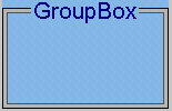
JadeSkinGroupBox Class
The
The group box skin images are drawn over the entire control area. The drawing of the caption depends on whether the skin definition includes a skin label reference (
The label is sized so that there is a three-pixel gap from the border area of the label to the left, right, top, and bottom of the caption. The caption or the label is drawn at the position indicated by the
The constants provided by the JadeSkinGroupBox class are listed in the following table.
| Constant | Integer Value | Description |
|---|---|---|
| CaptionPosition_Left_Top | 0 | Left-justified at the top |
| CaptionPosition_Left_Middle | 1 | Left-justified and centered vertically |
| CaptionPosition_Left_Bottom | 2 | Left-justified at the bottom |
| CaptionPosition_Right_Top | 3 | Right-justified at the top |
| CaptionPosition_Right_Middle | 4 | Right-justified and centered vertically |
| CaptionPosition_Right_Bottom | 5 | Right-justified at the bottom |
| CaptionPosition_Center_Top | 6 | Centered horizontally at the top |
| CaptionPosition_Center_Middle | 7 | Centered horizontally and vertically |
| CaptionPosition_Center_Bottom | 8 | Centered horizontally at the bottom |
The following image is an example of two group boxes. The example at the left has only the top and right border strips set.
JadeSkinJadeDockBase Class
The
The first example at the left of the following image shows an image drawn horizontally (by using the


The
JadeSkinJadeDockBar Class
The JadeSkinJadeDockBar class, a subclass of the
JadeSkinJadeDockContainer Class
The JadeSkinJadeDockContainer class, a subclass of the
JadeSkinJadeEditMask Class
The
The background area of a
JadeSkinJadeMask Class
The
JadeSkinJadeRichText Class
The
JadeSkinLabel Class
The
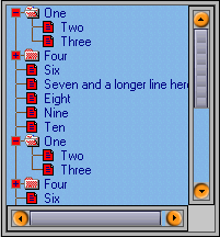
JadeSkinListBox Class
The
The images defined in these properties replace the equivalent image only if the standard JADE image has not been replaced in the list box.
The following image shows an example of a
JadeSkinOleControl Class
The
JadeSkinOptionButton Class
The
If you do not supply a specific state, the appropriate up image is used. If you do not supply the appropriate up image, the default option button image is drawn.
JadeSkinPicture Class
The
JadeSkinProgressBar Class
The
JadeSkinScrollBar Class
The
The JadeSkinScrollBar class provides the JadeSkinHScroll and JadeSkinVScroll control subclasses.
JadeSkinHScroll Class
The
This skin is also used for drawing the horizontal scroll bar for any control or form in the application.
The height of the border area and the height of the myLeftButton.imgUp image determine the height of the scroll bar. For a scroll bar control, the image is stretched vertically to fit the area inside the borders, as shown in the example in the following image.
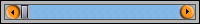
If you do not supply the image for a specific state, the appropriate up image is used. The default scroll button image is drawn if you do not supply the up image.
JadeSkinVScroll Class
The
This skin is also used for drawing the vertical scroll bar for any control or form in the application.
The width of the border area and the width of the
If you do not supply the image for a specific state, the appropriate up image is used. The default scroll button image is drawn if you do not supply the up image.
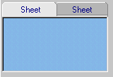
JadeSkinSheet Class
The
The following image shows an example of a sheet with a sunken three-dimensional effect.
JadeSkinStatusLine Class
The
The following image shows an example of a skinned status line.

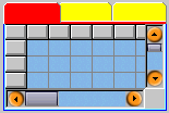
JadeSkinTable Class
The
The default value of Default_Color for these properties indicates that the table uses its normal color. The following image shows an example of the
JadeSkinTextBox Class
The
Text box controls do not successfully handle back brushes and non-solid colors for the backColor property.