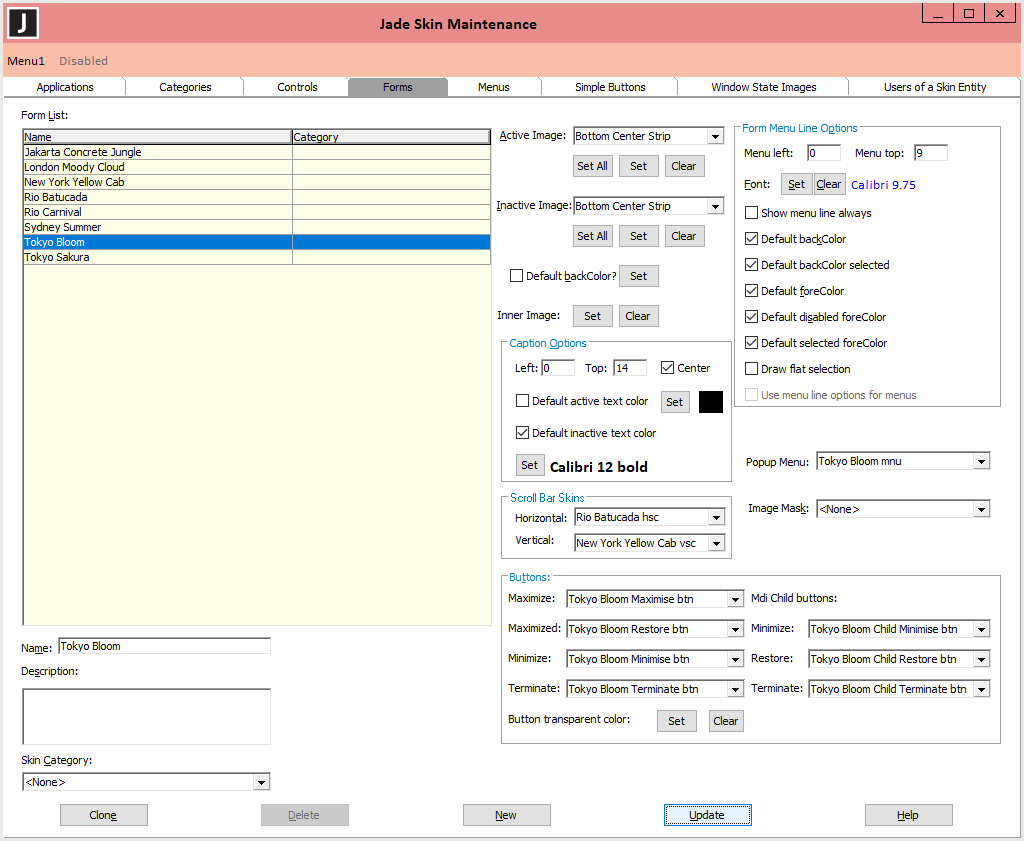
Using the Forms Sheet
The Forms sheet, shown in the following image, is displayed when you select the Forms tab in the Jade Skin Maintenance dialog.
To add a form skin
-
Click the New button if another form skin is selected.
-
Enter the name of the form skin in the Name text box or select the skin from the Form List table.
Form skin names must be unique.
-
Enter a description of the skin in the Description text box, if required.
-
In the Skin Category combo box, select the skin category that applies to the control skin or select the default <none> entry.
A control skin is applied only to controls of the same type with the same defined skin category.
-
In the Active Image and Inactive Image combo boxes, you can set all active and inactive form images by clicking the appropriate Set All button below the respective combo boxes to request the loading of all pictures that describe the active or inactive form skin.
A series of common File dialogs is then displayed, to enable you to locate each of the pictures required in turn. The title of the common dialog displays the required image. If you do not have a file for a specific image or you do not want to specify a file for that image, simply click the Cancel button to enable you to select the picture file for the next image. If you cancel a common dialog display for any picture, the default image is used for that property.
When you have specified (or cancelled) the appropriate picture file for each image that you want to define, the common dialog is then closed and focus returns to the Forms sheet of the Jade Skin Maintenance dialog. Alternatively, you can perform one of the following actions.
-
Set a specific form skin image by selecting the image type in the combo box (for example, Right Strip) and then clicking the Set button. The common File dialog is then displayed, to enable you to locate the picture file that you want to define or change.
-
Clear an existing image by selecting the image type in the combo box and then clicking the Clear button.
-
-
To select a background color for the form, check the Default backColor check box. The common Color dialog is then displayed, to enable you to select the background color that you require. The background color is used only when an inner image is not set or it is not a brush. If you want to restore the default background color of the control when you have selected a custom color, check the Default backColor check box so that a check mark symbol (✓) is displayed and the default color is restored.
-
If you want to set the inner image of the form, click the Set button at the right of the Inner Image caption. The common File dialog is then displayed, to enable you to locate the picture file that you want to define or change.
If you set an inner image, the Is brush? check box is then displayed at the right of the Clear button. By default, this check box is unchecked (that is, the image is centered in the inner area of the form rather than repeatedly drawn over the whole area of the form).
Alternatively, to clear an existing inner image for the form, click the Clear button.
-
Use the text box or check box controls in the Caption Options group box to position the form captions to meet your requirements. If you want to center the caption, check the Center? check box. Any value specified in the Left text box is ignored unless the caption is too large for the available area. The Left and Top text boxes indicate the number of pixels to offset the caption start position (for example, 49 and 6, respectively).
-
To select a color for text on active and inactive captions on your skinned forms, uncheck the Default active text color and Default inactive text color check boxes in the Caption Options group box.
The common Color dialog is then displayed, to enable you to select the active and inactive text colors that you require.
If you want to restore the default color (specified on the Appearance sheet of the Display dialog, accessed from the Display icon in the Control Panel for your workstation) of text on active or inactive forms when you have selected a custom color, check the Default active text color or Default inactive text color check box so that a check mark symbol (✓) is displayed and the default text color restored.
-
Use the Set button in the Caption Options or Form Menu Line Options group box to change the font if you do not want Tahoma 8.25 regular font to be used for your form captions or the default font for your menus. The common Font dialog is then displayed, to enable you to select the required font and its attributes.
User font preferences are not used when displaying the caption and menus, as they may be inappropriate for the skin.
-
If you want specific horizontal and vertical scroll bar skins to be assigned to the Form skin, select the horizontal or vertical skin that you require from the Horizontal or Vertical combo box, respectively, in the Scroll Bar Skins group box. For details, see "Changing the Skin of a Scroll Bar", later in this document.
-
Use the text box or check box controls in the Form Menu Line Options group box to position menus on your forms to meet your requirements. The Menu left and Menu top text boxes indicate the number of pixels to offset the menu start position (for example, 43 and 4, respectively).
-
Check the Show menu line always check box in the Form Menu Line Options group box if you want to specify that both the caption line and the menu line are always displayed on each form, regardless of whether the form has a menu. When you uncheck this check box (that is, it is set to false), the menu line is displayed only on forms that have a menu.
-
In the Form Menu Line Options group box, uncheck the following check boxes if you do not want your forms skin to use the:
-
Default backColor
-
Default backColor selected
-
Default foreColor
-
Default disabled foreColor
-
Default selected foreColor
-
-
Check the Draw flat selection check box if you want a selected menu line always drawn in a flat manner using the defined menu line selection colors (with no surrounding border). In addition, the menu line item is not drawn as though it is part of the popup menu.
This check box is unchecked by default; that is, the selected menu line item is drawn using the effective menu line selection background and foreground colors with a border that is the same color as the text of the menu line. In addition, when a menu is dropped down directly below menu line (the menu does not need to be moved to fit on the current display), the selected menu item is drawn as though it is part of the dropped‑down menu using the same background color and text color defined for the popup menu.
-
When <None> is displayed in the Popup Menu combo box, the Use Menu Line Options For Menus check box is enabled, and unchecked by default. This controls whether the menu line definition of a form skin is used to draw menus when no popup menu is selected (that is, <None>). When the Use Menu Line Options For Menus check box is unchecked and the Popup Menu combo box displays <None>, menus are not skinned.
When this check box is checked and the Popup Menu combo box displays <None>, menus are drawn using the menu line properties (that is, font, colors, and so on).
-
In the Popup Menu combo box, select the drop-down and popup menu skin that you want displayed on your forms, if required. Before you can select a popup menu skin to apply to your forms, you must first have defined the menu skin by using the Menus sheet. For details, see "Using the Menus Sheet", in the following subsection.
If a popup menu skin is set for the form, the Use menu line options for menus check box is unchecked and disabled.
-
In the Image Mask combo box, select a non-rectangular region mask image to be applied to the form skin. To remove an applied mask, select the <None> value (the default).
-
In the Maximize, Maximized, Minimize, and Terminate combo boxes at the left of the Buttons group box, select the images that you want to apply to your skin for the form’s maximize, maximized, minimize, and terminate buttons, respectively.
-
If the form icons have been created with a transparent color surround, click the Set button in the Buttons group box. The common Color dialog is then displayed, to enable you to select or define the transparent color that you require. Alternatively, clear an existing button transparent color by clicking the Clear button.
-
In the MDI child buttons Minimize, Restore, and Terminate combo boxes at the right of the Buttons group box, select the images that you want to apply to your skin for the minimize, restore, and terminate buttons, respectively, on MDI child forms.
-
Click the Update button.
To update an existing form skin
-
In the Form List table, select the form skin that you want to change. The name of the selected form skin is then displayed in the Name text box.
-
Edit the appropriate data to meet your requirements. (For details, see steps 2 through
-
Click the Update button.
To delete an existing form skin
-
In the Form List table, select the application skin that you want to delete. The name of the selected form skin is then displayed in the Name text box.
-
Click the Delete button. The Delete button is disabled if the form skin is referenced by any other application skin entity.
-
A message box advises you that the skin may be referenced externally and prompts you to confirm that the skin can be safely deleted.
-
Click the Yes button to confirm the deletion. Alternatively, click the No button to abandon the deletion.
For details about cloning an existing skin of a form, see "Cloning Skins", elsewhere in this document.