Defining and Maintaining Table Control Skins
The Controls sheet, shown in the following image, is displayed when the
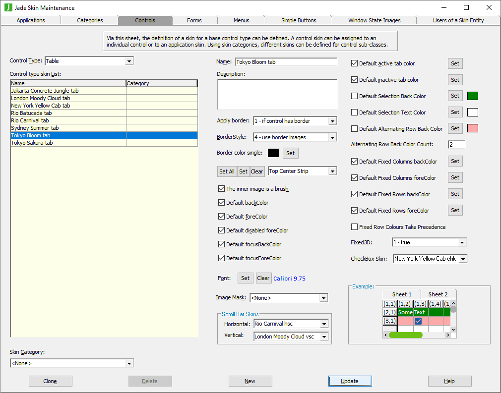
The list of control skins for the
To define or maintain a table control skin
-
Perform the actions that you require to define a Table control skin or change an existing skin.
For details about the areas of the Controls sheet that are common to all control types, see "Using the Controls Sheet".
-
If you do not want the default active or inactive tab color used for your table skin, uncheck the Default active tab color? or Default inactive tab color? check box, respectively.
The common Color dialog is then displayed, to enable you to select the active or inactive color that you require for your table tabs. Alternatively, click the Set button at the right of these check boxes if you want to change the default active or inactive tab color by selecting the required value in the common Color dialog.
-
If you do not want a default background color for selected items in a table, uncheck the Default Selection Back Color check box.
The default value of #80000000 (that is, transparent) means that the default selection background color defined by Windows is used, but you can select your required selected item background color by unchecking this check box and then selecting a color or defining your own custom color in the common Color dialog that is displayed.
-
If you do not want a default text color for selected items in a table, uncheck the Default Selection Text Color check box.
The default value of #80000000 (that is, transparent) means that the default selection text color defined by Windows is used, but you can select your required selected item background color by unchecking this check box and then selecting a color or defining your own custom color in the common Color dialog that is displayed.
-
If you want a default background color for alternating table rows, check the Default Alternating Row Back Color? check box. The default color is Azure, but you can select your required alternating background color by clicking this check box and then selecting a color or defining your own custom color in the common Color dialog that is displayed.
If the value of the Alternating Row Back Color Count text box is zero (0) or less, the value of the Default Alternating Row Back Color check box is ignored and does not apply.
-
If you checked the Default Alternating Row Back Color check box in the previous step of this instruction, specify the number of table rows at which the alternating background color of each visible non‑fixed row and non‑fixed cell is displayed. If this text box contains the default value of zero (0) or less, the background color of each non‑fixed cell defaults to the value of the backColor property of the sheet and the Default Alternating Row Back Color check box is ignored.
For example, if the count is 2, the first, third, fifth, and so on non‑fixed rows and the non‑fixed cells in that row default to the value of the backColor property of the sheet, while the second, fourth, sixth, and so on non‑fixed rows and the non-fixed cells in that row default to the value of the alternatingRowBackColor property.
-
If you want to specify the background color of fixed columns or rows, check the Default Fixed Columns backColor or Default Fixed Rows backColor check box, respectively.
The common Color dialog is then displayed, to enable you to select the background color that you require for your fixed rows or columns. Alternatively, click the Set button at the right of these check boxes if you want to change the background color of rows or columns by selecting the required value in the common Color dialog.
-
If you want to specify the foreground color of fixed columns or rows, check the Default Fixed Columns foreColor or Default Fixed Rows foreColor check box, respectively.
The common Color dialog is then displayed, to enable you to select the foreground color that you require for your fixed rows or columns. Alternatively, click the Set button at the right of these check boxes if you want to change the foreground color of rows or columns by selecting the required value in the common Color dialog.
-
If you want the cells that are in both a fixed row and a fixed column drawn using the value of the fixedColumnsBackColor and fixedColumnsForeColor properties, uncheck the Fixed Row Colors Take Precedence check box.
This check box is checked by default; that is, cells that are in both a fixed row and a fixed column are drawn using the values of the fixedRowsBackColor and fixedRowsForeColor properties.
If a fixed cell has a specific:
-
Background color set by the backColor property of the Table class for a cell, row, or column, the skin background color value specified by the fixedRowColorHasPrecedence property is ignored when drawing the background of a fixed cell.
-
Foreground color set by the foreColor property of the Table class for a cell, row, column, the skin foreground color value specified by the fixedRowColorHasPrecedence property is ignored when drawing the text of a fixed cell.
If a fixed cell has a specific foreColor or backColor set via a cell, row, or column foreColor or backColor property value, the skin back color values that you set in steps 5 and 6 of this instruction are ignored.
-
-
If you want fixed three-dimensional rows in your tables, in the Fixed3D combo box (which defaults to zero (0) - false), select 1 - true or 2 - use control setting.
-
If you want a check box skin to be used when drawing a cell that has the inputType property set to InputType_CheckBox or a cell control set to a check box control, select the check box skin that you required from the list of all available check box skins displayed in the list portion of the CheckBox Skin combo box.
The default value of <none> indicates that check boxes in table cells are drawn without a skin.