Defining and Maintaining ListBox Control Skins
The Controls sheet, shown in the following image, is displayed when the
The list of control skins for the
To define or maintain a list box control skin
-
Perform the actions that you require to define a list box control skin or change an existing skin. For details about the areas of the Controls sheet that are common to all control types, see "Using the Controls Sheet".
-
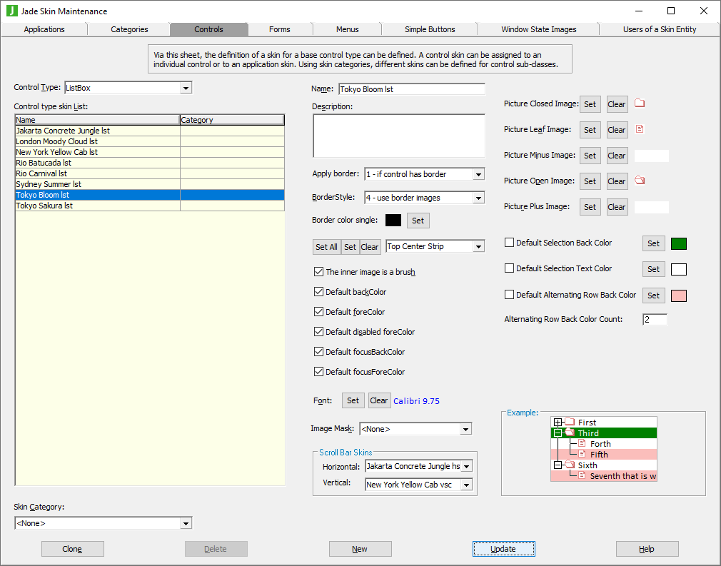
If you want to select the image that is displayed for the closed, leaf, minus, open, or plus picture of the list box control that supports pictures, click the appropriate Set button at the right of the required caption.
The common File dialog is then displayed, to enable you to select the existing image that you want displayed for the list box picture. To apply the image, click the Open button in the common dialog.
When you have selected the appropriate picture file for the image, the common dialog is then closed and focus returns to the Controls sheet of the Jade Skin Maintenance dialog. In addition, your selected image is displayed in the text box at the right of the appropriate caption.
-
If you do not want a default background color for selected items in a list box, uncheck the Default Selection Back Color check box.
The default value of #80000000 (that is, transparent) means that the default selection background color defined by Windows is used, but you can select your required selected item background color by unchecking this check box and then selecting a color or defining your own custom color in the common Color dialog that is displayed.
-
If you do not want a default text color for selected items in a list box, uncheck the Default Selection Text Color check box.
The default value of #80000000 (that is, transparent) means that the default selection text color defined by Windows is used, but you can select your required selected item background color by unchecking this check box and then selecting a color or defining your own custom color in the common Color dialog that is displayed.
-
If you want a default background color for alternating list box rows, check the Default Alternating Row Back Color check box. The default color is Azure, but you can select your required alternating background color by clicking this check box and then selecting a color or defining your own custom color in the common Color dialog that is displayed.
If the value of the Alternating Row Back Color Count text box is zero (0) or less, the value of the Default Alternating Row Back Color check box is ignored and does not apply.
-
If you checked the Default Alternating Row Back Color check box in the previous step of this instruction, specify the number of visible entry list rows at which the alternating background color is displayed. If this text box contains the default value of zero (0) or less, the background color of each visible list box entry defaults to the value of the backColor property of the ListBox control and the Default Alternating Row Back Color check box is ignored.
For example, if the count is 2, the first, third, fifth, and so on visible entries in the list default to the value of the backColor property of the ListBox control, while the second, fourth, sixth, and so on visible entries default to the value of the Default Alternating Row Back Color check box.
-
If you want to remove the current list box picture image, click the Clear button at the right of the appropriate caption.
The image is then removed from the text box at the right of the caption on the Controls form.