Defining and Maintaining GroupBox Control Skins
The Controls sheet, shown in the following image, is displayed when the
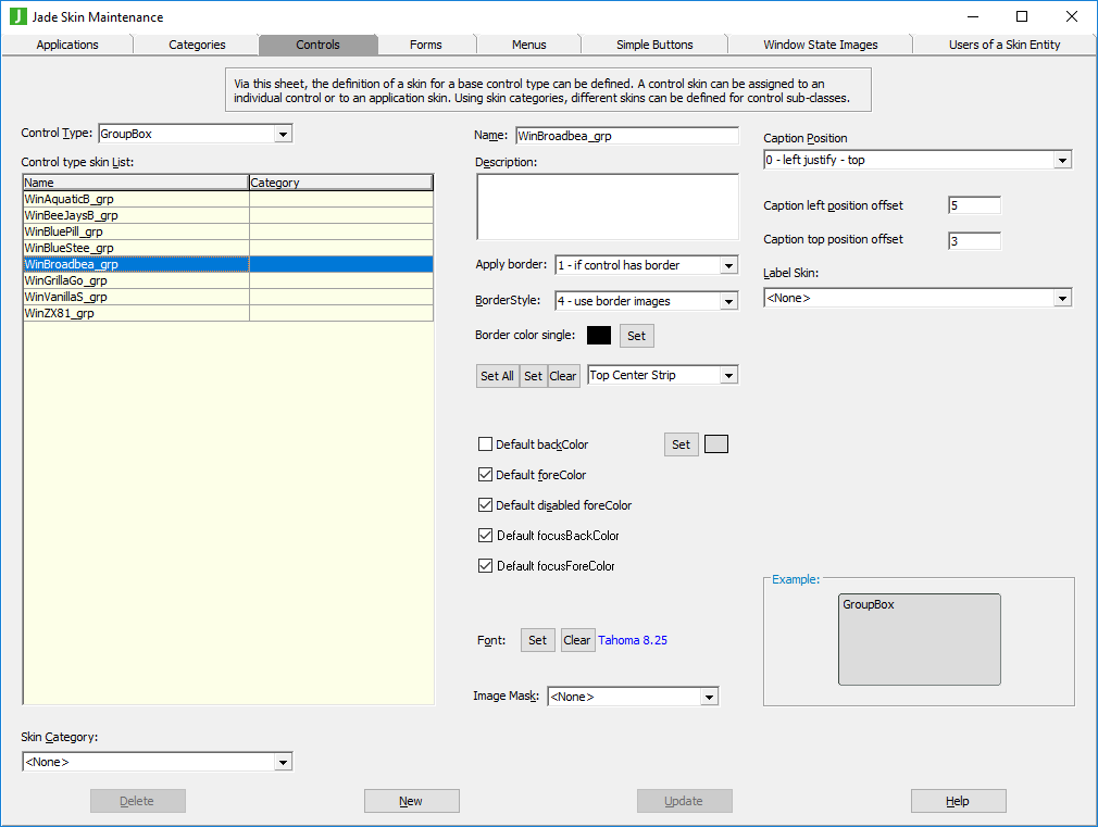
The list of control skins for the
To define or maintain a group box control skin
-
Perform the actions that you require to define a group box control skin or change an existing skin. For details about the areas of the Controls sheet that are common to all control types, see "Using the Controls Sheet".
-
In the Caption Position combo box, select the position that you require for the group box caption.
-
In the Caption Position Left Offset text box, specify the signed integer modifier for the selected left position of the caption. For example, to position the text nine pixels in the top left corner, select the 0 – left justify – top caption position in step 2 and then set the caption left offset to 9. To position the text nine pixels indented from the top right-hand corner, select the 3 – right justify – top caption position in step 2 and then set the caption left position to –9 (minus 9).
-
In the Caption Position Top Offset text box, specify the signed integer modifier for the selected top position of the caption. For example, to position the text nine pixels from the bottom right of the group box control, select the 5 – right justify – bottom caption position in step 2 and then set the caption position top offset to –9 (minus 9).
-
In the Label Skin combo box, select the image that you require for the group box label if you want the text drawn as though it was a label so that the text portion of the group box can have its own border and background color, brush, or image.