Defining and Maintaining Folder Control Skins
The Controls sheet, shown in the following image, is displayed when the
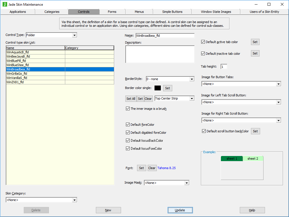
The list of control skins for the
To define or maintain a folder control skin
-
Perform the actions that you require to define a folder control skin or change an existing skin. For details about the areas of the Controls sheet that are common to all control types, see "Using the Controls Sheet".
-
If you do not want the default active or inactive tab color used for your folder skin, uncheck the Default active tab color? or Default inactive tab color? check box.
The common Color dialog is then displayed, to enable you to select the active or inactive color that you require for your folder tabs.
Alternatively, click the Set button at the right of these check boxes if you want to change the default active or inactive tab color by selecting the required value in the common Color dialog.
-
If you want to change the height of the tabs in a folder that uses the default tab height, specify the number of pixels in the Tab height text box.
If the height of the tabs for the folder has been specifically set, the specified value is ignored.
By default, the tab height is set to zero (0), indicating that the default height is the calculated text height using the font of the folder. If you set the tab height to a positive value, each tab is drawn the specified number of pixels high.
-
In the Image for Button Tabs combo box, select the image that you require for the tabs in your folder skin when the tabs have the button style applied.
-
In the Image for Left Tab Scroll Button combo box, select the set of images that define the normal, rollover, disabled, and down states of the left tab scroll button when not all sheet tabs can be displayed in the folder. The button image is vertically centered in the tab line.
The left arrow button is displayed on the left of the tabs line. The sheet tab that is farthest left is positioned to the right of the arrow. The arrow is drawn bordered with a black box the height of the tab line, and the background color is the value of the backColor property of the folder.
By default, no image is defined; that is, the default left arrow is displayed.
-
In the Image for Right Tab Scroll Button combo box, select the set of images that define the normal, rollover, disabled, and down states of the right tab scroll button when not all sheet tabs can be displayed in the folder. The button image is vertically centered in the tab line.
The right arrow is displayed at the end of the tab line, possibly obscuring part of the last sheet tab that is displayed. The arrow is drawn bordered with a black box the height of the tab line, and the background color is the value of the backColor property of the folder.
By default, no image is defined; that is, the default right arrow is displayed.
-
If you do not want the default active or inactive tab color used for your folder tab buttons when not all sheet tabs can be displayed, uncheck the Default scroll button backColor check box. The common Color dialog is then displayed, to enable you to select the active or inactive color that you require for your folder tab overflow scroll buttons. If a button image is not defined, the value of the scroll button back color is ignored.
Alternatively, click the Set button at the right of the check box if you want to change the default active or inactive tab color by selecting the required value in the common Color dialog. If a button image is not defined, the scroll button background color is ignored.