Defining and Maintaining CheckBox Control Skins
The Controls sheet, shown in the following image, is displayed when the
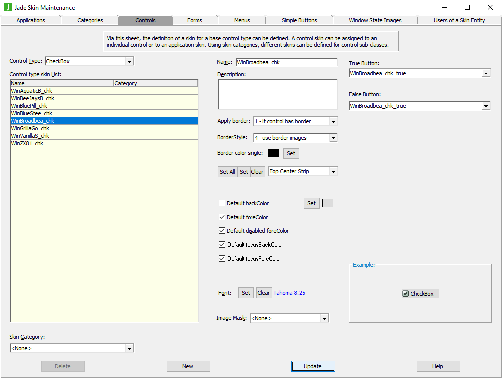
The list of control skins for the
Before you can specify the true and false check box buttons for your check box skin, you must first have defined these check box buttons by using the Simple Buttons sheet. For details, see "Using the Simple Buttons Sheet".
To define or maintain a check box control skin
-
Perform the actions that you require to define a check box control skin or change an existing skin. For details about the areas of the Controls sheet that are common to all control types, see "Using the Controls Sheet".
-
In the True Button and False Button combo boxes, select the true and false check box button images for the true and false check box states.
If you do not select an image, the default check box image is drawn.