Defining and Maintaining Button Control Skins
The Controls sheet, shown in the following image, is displayed when the
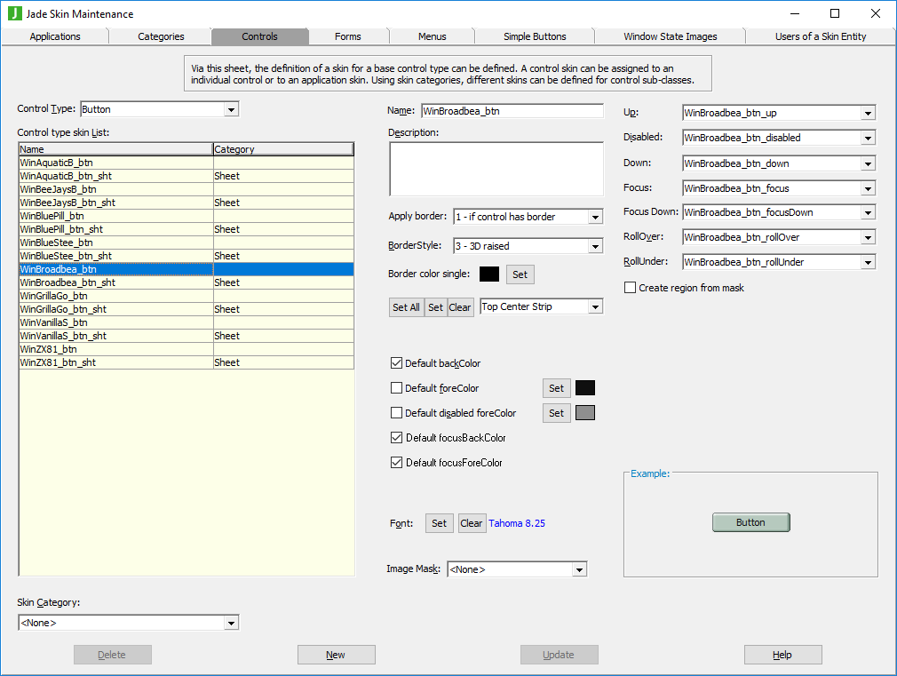
The list of control skins for the
Before you can specify the image states for button controls, you must first have defined these images by using the Window State Images sheet. For details, see "Using the Window State Images Sheet".
To define or maintain a button control skin
-
Perform the actions that you require to define a button control skin or change an existing skin. For details about the areas of the Controls sheet that are common to all control types, see "Using the Controls Sheet".
-
In the Up, Disabled, Down, Focus, Focus Down, RollOver, and RollUnder combo boxes, select the images drawn for each button state.
If you do not select an image for a button state, the default value of <None> indicates that the background color is used to fill the non-border area of the button in the up state.
Button images are drawn inside any defined border area.
The following image on the left is an example of a button with a raised three-dimensional effect. The image on the right is an example of a button with a sunken three-dimensional effect.


-
Check the Create region from mask? check box if you want the image selected in the Image Mask check box used to create a non-rectangular region for painting the button.
When this check box is unchecked (the default value), the full rectangular button area is drawn using the skin. The image mask then applies only to any mouse actions. For example, if the button is an unusual shaped image on a background, the button then displays only the rollover and click images when the mouse is over that special area.