Using a List Box to Display a Hierarchy or Tree
The ListBox class also provides features to display items in a hierarchy. Each item in the list can have subordinate items visually represented by indentation levels. When an item is expanded, its subordinate items are visible. When an item is collapsed, its subordinate items are hidden.
Items in the ListBox control can also display graphical elements to provide visual cues about the state of the item. Picture images in a list box are transparent only if the image type in JADE handles transparency; for example, icons or Graphics Interchange Format (GIF) files. If the image is a bitmap, the list box treats any white pixels on the outside of the image as transparent.
The following image shows an example of the types of the extended feature display.
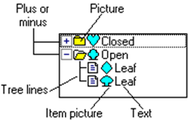
The display is made up of the parts listed in the following table.
| Display Part | Description |
|---|---|
| Tree lines | The tree lines are displayed if the hasTreeLines property is set to true. Clicking on this image causes a pictureClick event, in which logic can expand or collapse the item. |
| Plus or minus | An icon or bitmap is displayed if the hasPlusMinus property is set to true and the list item has subitems. A different image is normally displayed, depending on whether the item is expanded or collapsed. The default images are shown in the above image. These images can be changed by using the picturePlus and the pictureMinus properties. Clicking this portion of an item has the same impact as tree lines. |
| Picture | The picture image is present if the hasPictures property is set to true. The type of image that is displayed depends on whether the item has subitems, or is closed or expanded. The default images are shown in the above image. These images can be changed by using the pictureClosed, pictureOpen, and pictureLeaf properties. Clicking this portion of an item has the same impact as tree lines. |
| Item picture | If the list item has a picture (set by the itemPicture property), that picture is placed after all other images, just before the text. The picture is scaled to fit the list item height. |
| Text | The text portion of the list item is always present. An item is selected only (setting the listIndex property) when the text is clicked, or when arrow keys, the Page Up, Page Down, Home, or End key selects a new item. Clicking the text area causes a click event and selects that item as the current item. |
If the sorted property is set to true, the hierarchical properties (hasPictures, hasPlusMinus, and hasTreeLines) are set to false. See also "Setting Properties for Individual Items in a List Box", in the previous subsection.