The Controls sheet, shown in the following diagram, is displayed when the
The list of control skins for the
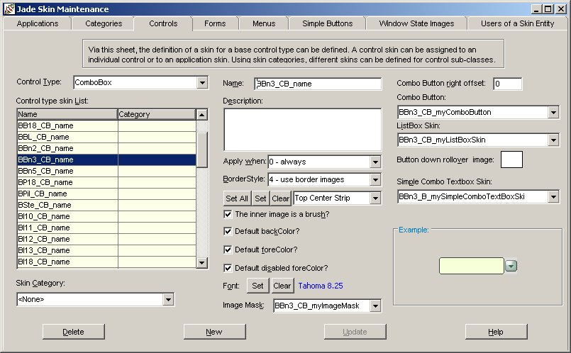
To define or maintain a combo box control skin
Perform the actions that you require to define a combo box control skin or change an existing skin. For details about the areas of the Controls sheet that are common to all control types, see "Using the Controls Sheet".
In the Combo Button right offset text box, specify the number of pixels from the right-hand edge to position the right-hand edge of the combo box button. By default, the combo box button is not offset and it is centered vertically.
In the Combo Button and ListBox Skin combo boxes, select the images that you want to apply to the button and list box areas of the combo box, respectively.
If you want to specify an image for the combo box button rollover state in the down position, click the Button down rollover image text box.
The common File dialog is then displayed, to enable you to select the existing image that you want displayed. To apply the image, click the Open button in the common dialog. If you want to remove a rollover state down position image for the combo box, click the Cancel button in the common dialog.
When you have specified (or cancelled) the appropriate picture file for the combo box button image, the common dialog is then closed and focus returns to the Controls sheet of the Jade Skin Maintenance dialog.
In the Simple Combo Textbox Skin combo box, select the image that you require for the text box area of a simple combo box.